Feed PHX
Branding & Identity & Illustration & Motion Design
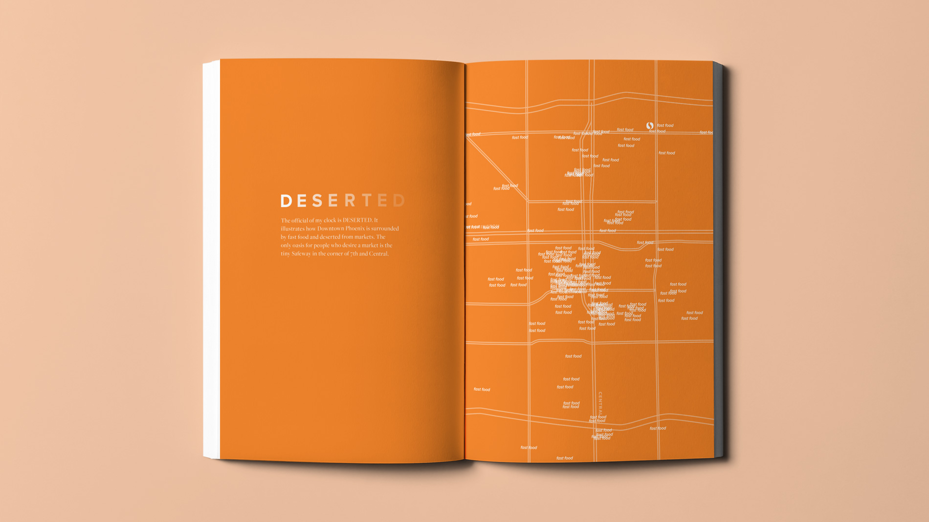
My senior project, Feed PHX, tackles the very present, very relevant problem of food deserts in Downtown Phoenix. Over 1.5 million people don’t have access to healthy foods in Phoenix. Instead, they’re forced to turn to unhealthy alternatives to keep afloat. Or are they?
As part of my research, I found that Phoenix has many initiatives targeting the problem of grocery stores in Downtown Phoenix. It was my mission to bring this initiatives to the light, and show Phoenix that there is something for them, and they haven’t been deserted.
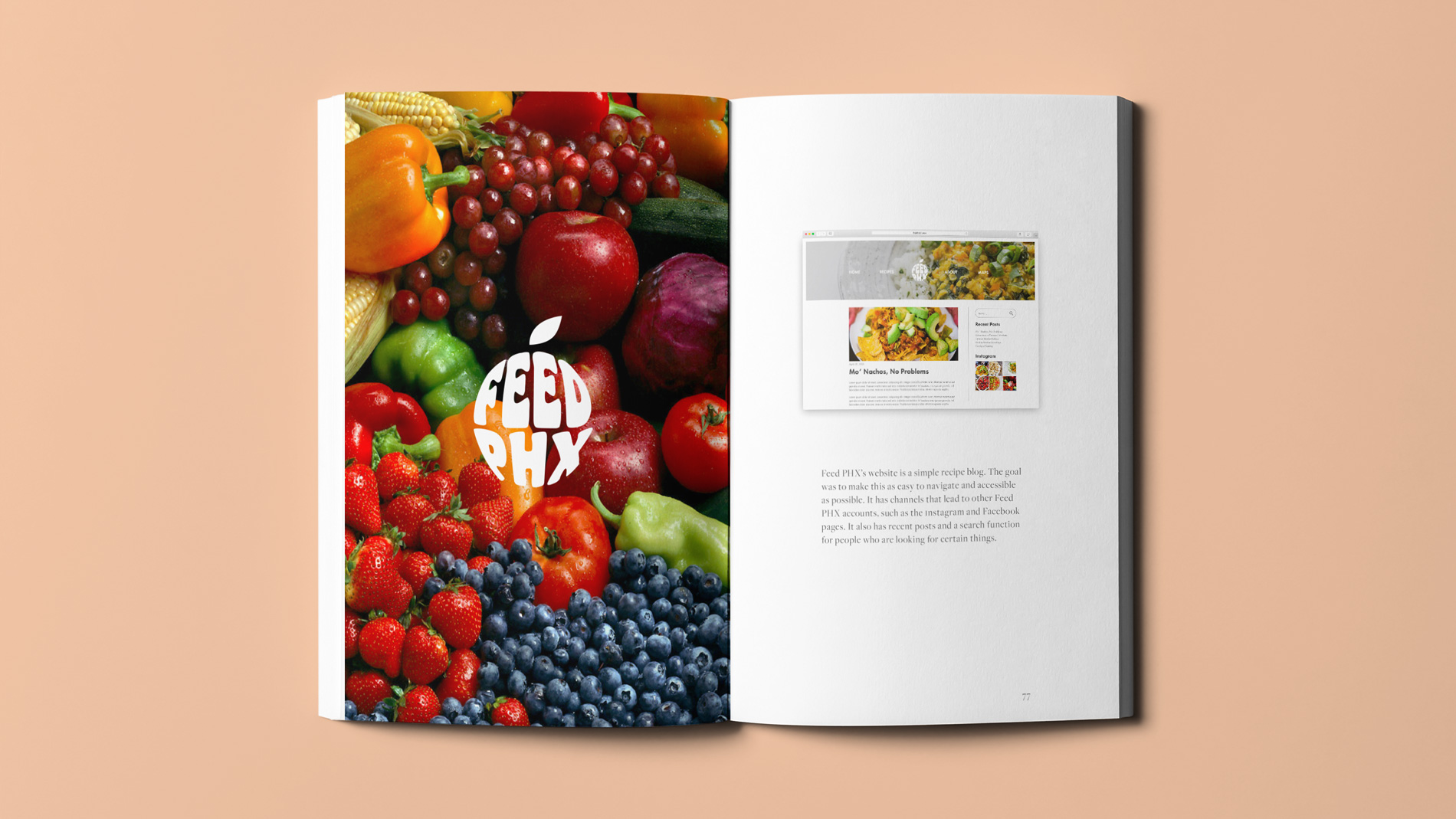
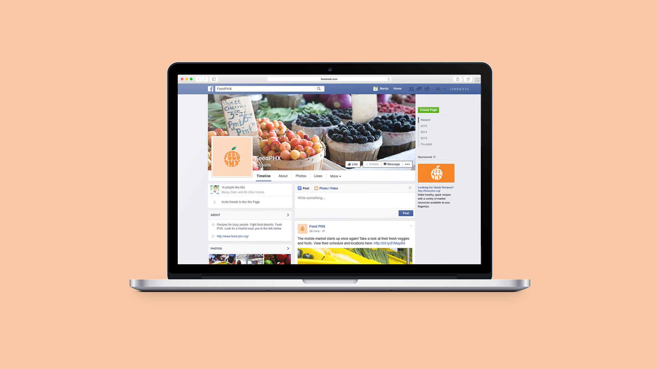
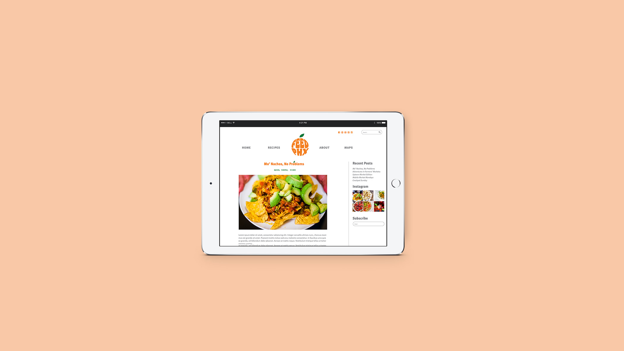
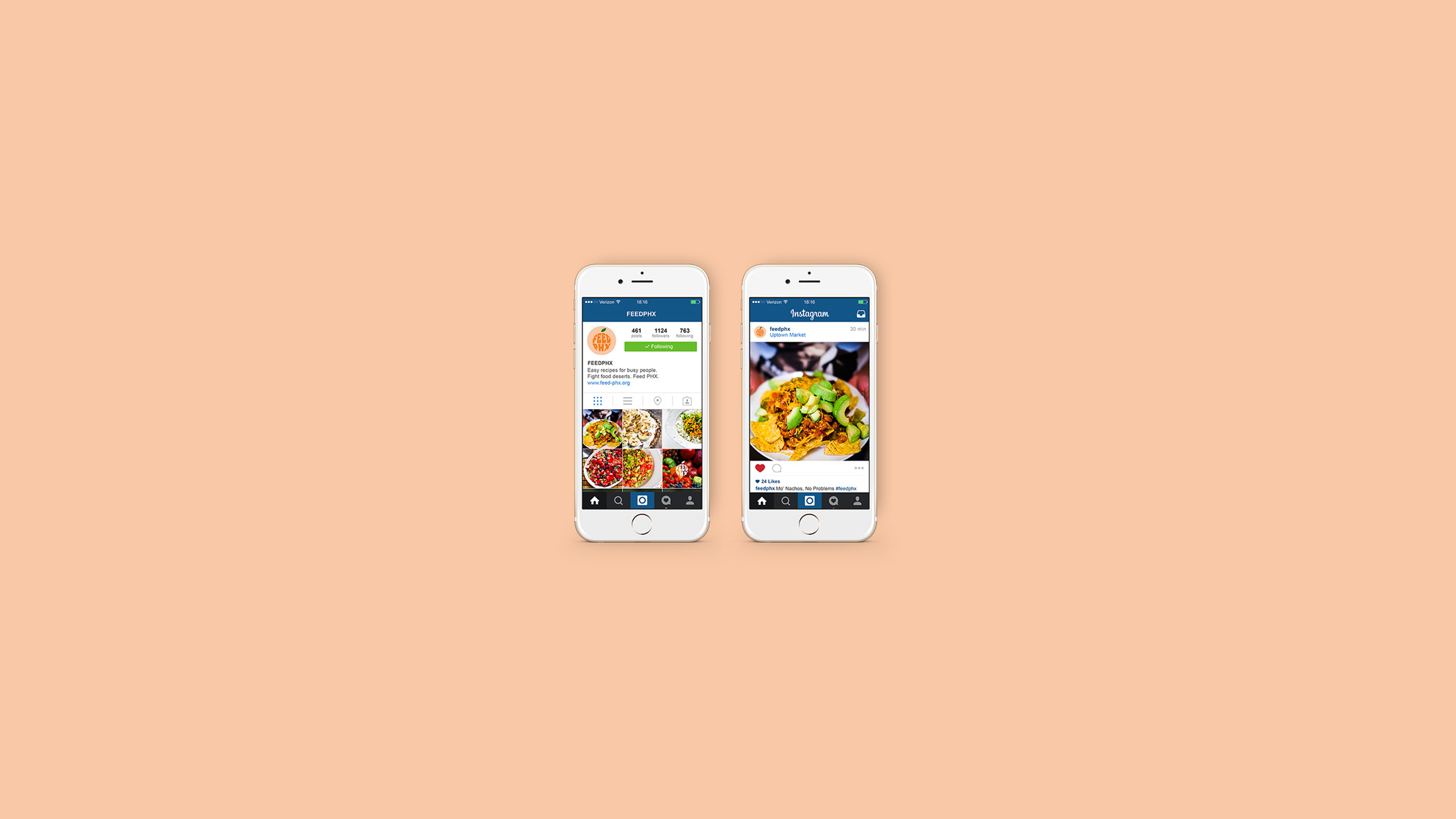
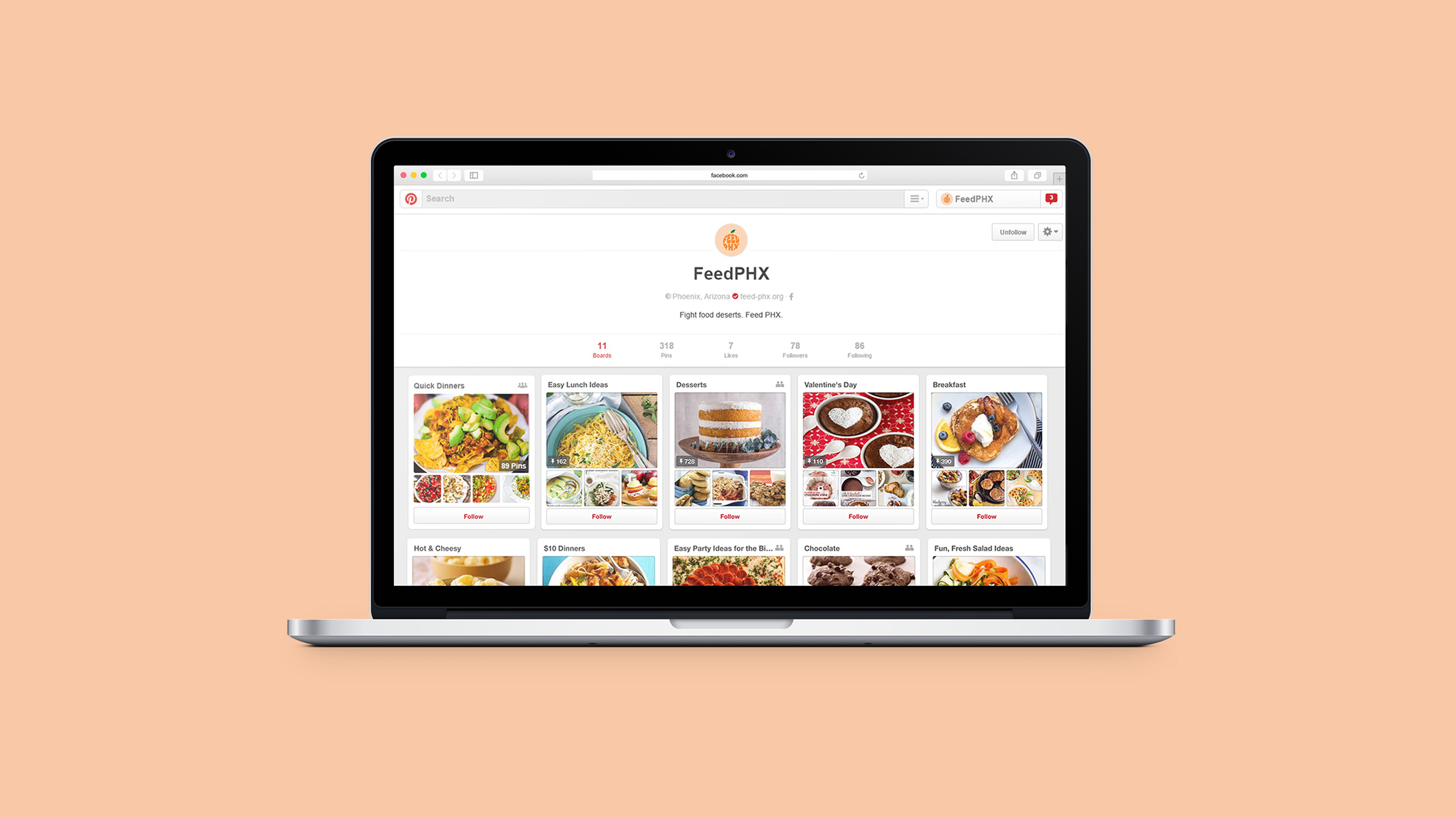
The first part, the actual core of Feed PHX, is the website. The website is a recipe blog that targets parents, ages 25–35. I wanted something uplifting and functional, even outside of the Phoenix scope. The recipe blog posts 3–4 times a week, with tips on things like making fruits and vegetables last, interviews with farmers’ markets around Phoenix, and, of course, recipes. The recipes are simple, quick and meant to made in bulk. To bring my audience to the website, there is a Facebook, Instagram and Pinterest.
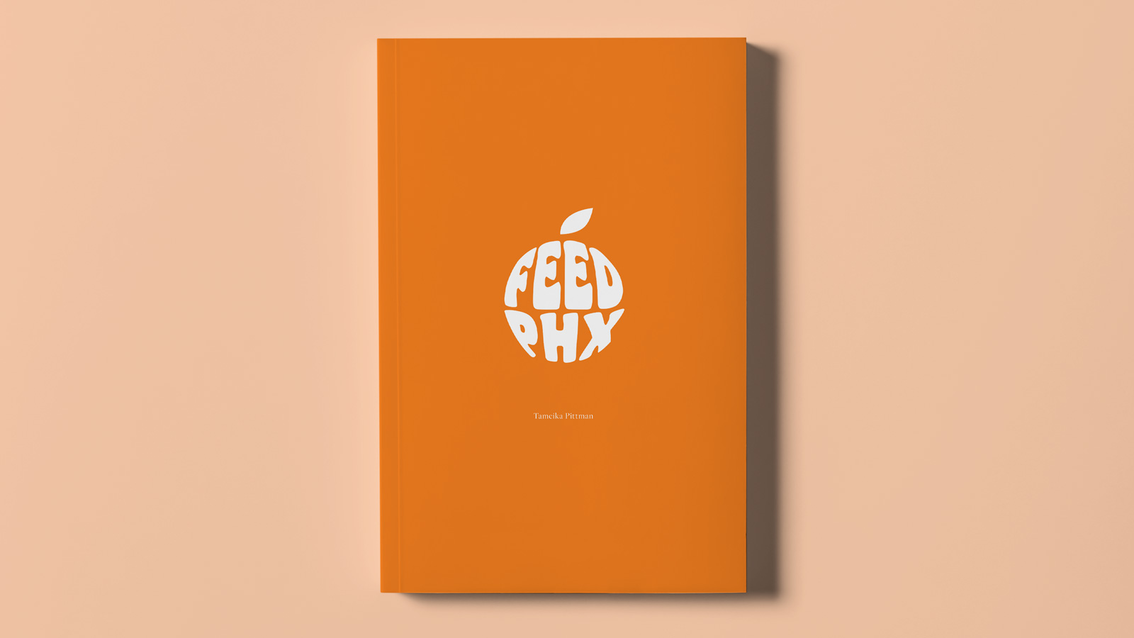
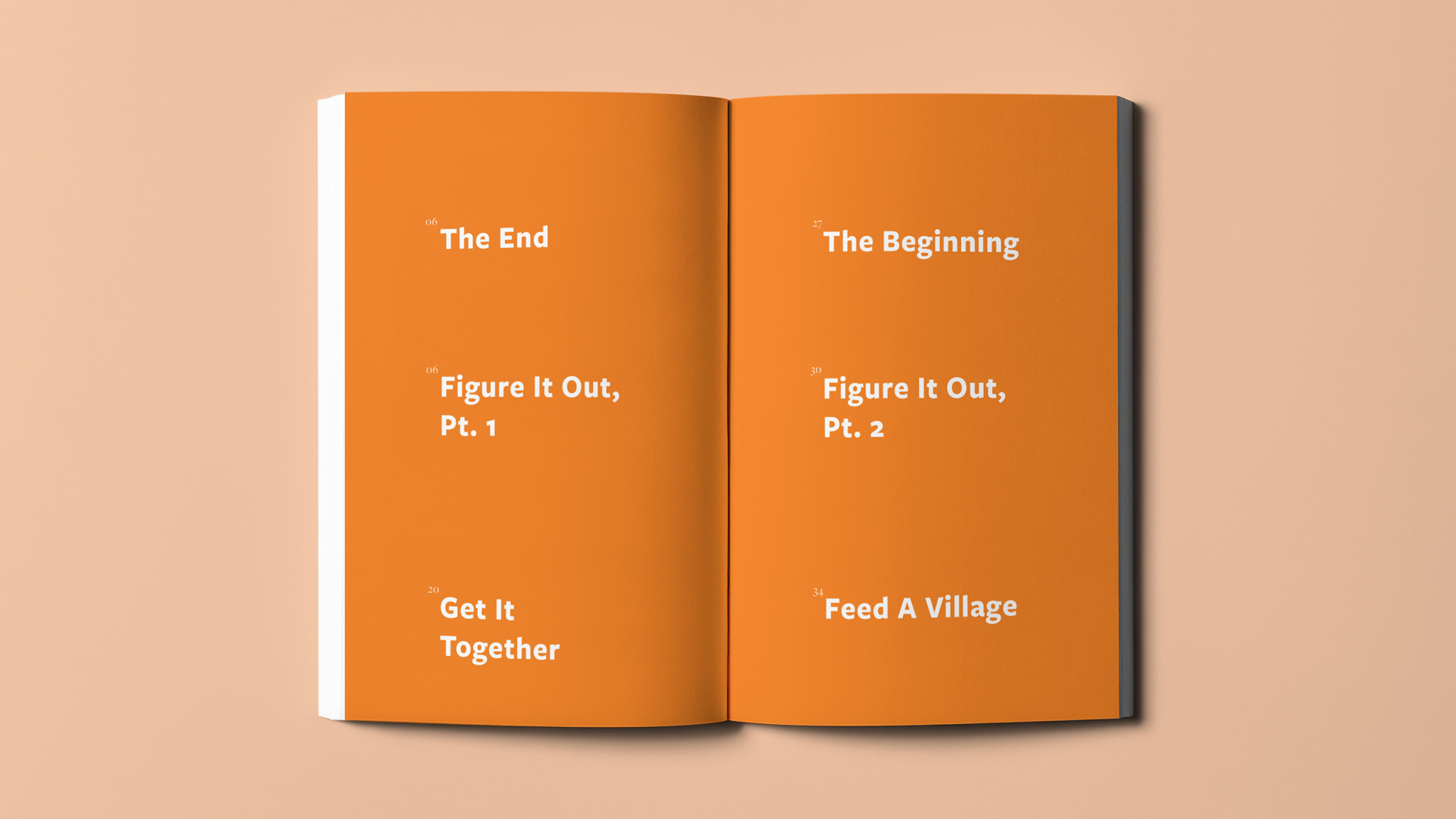
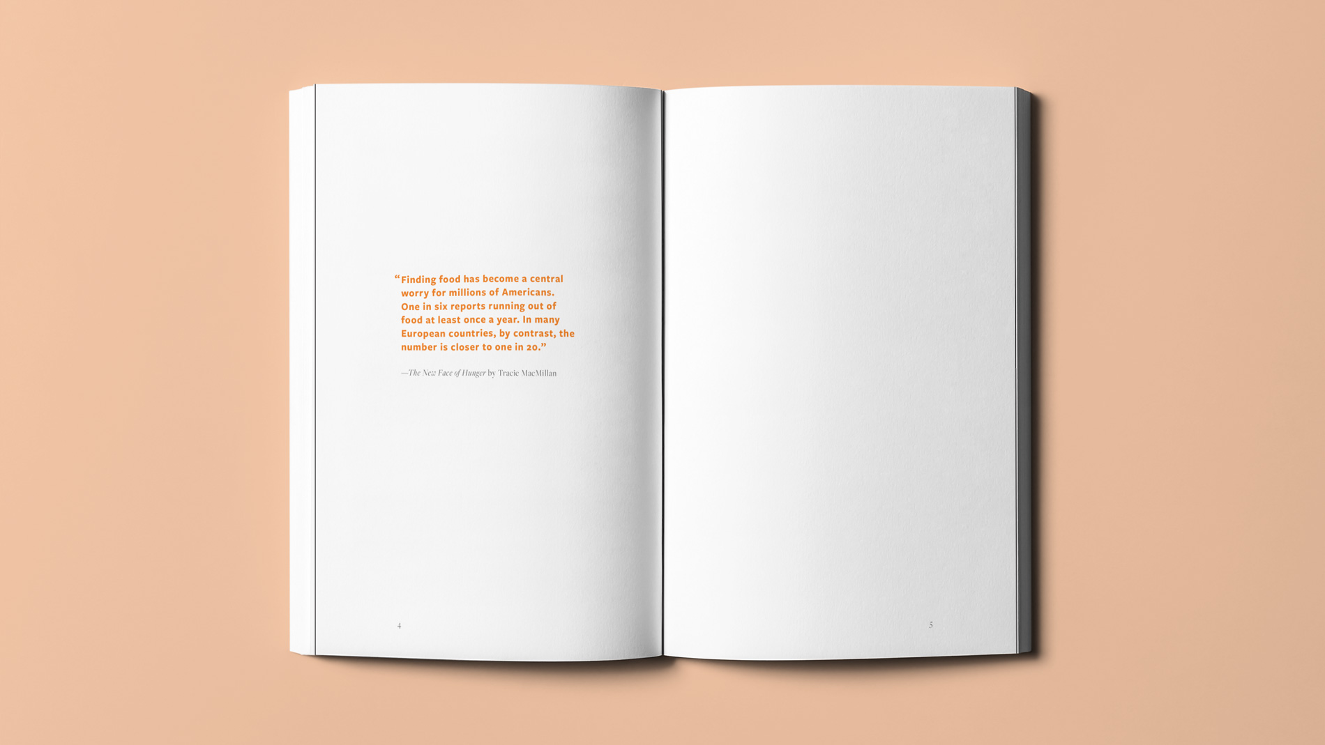
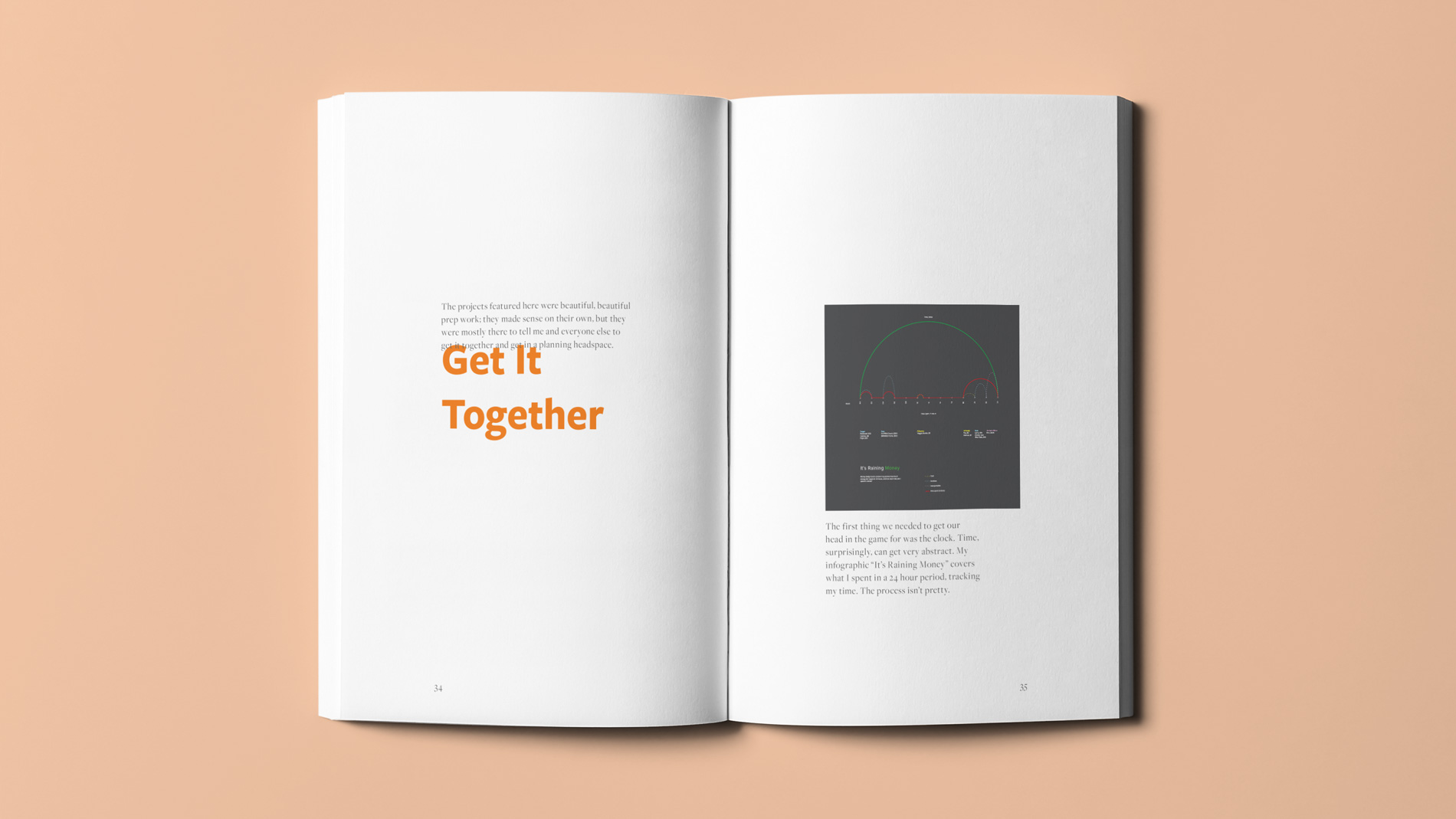
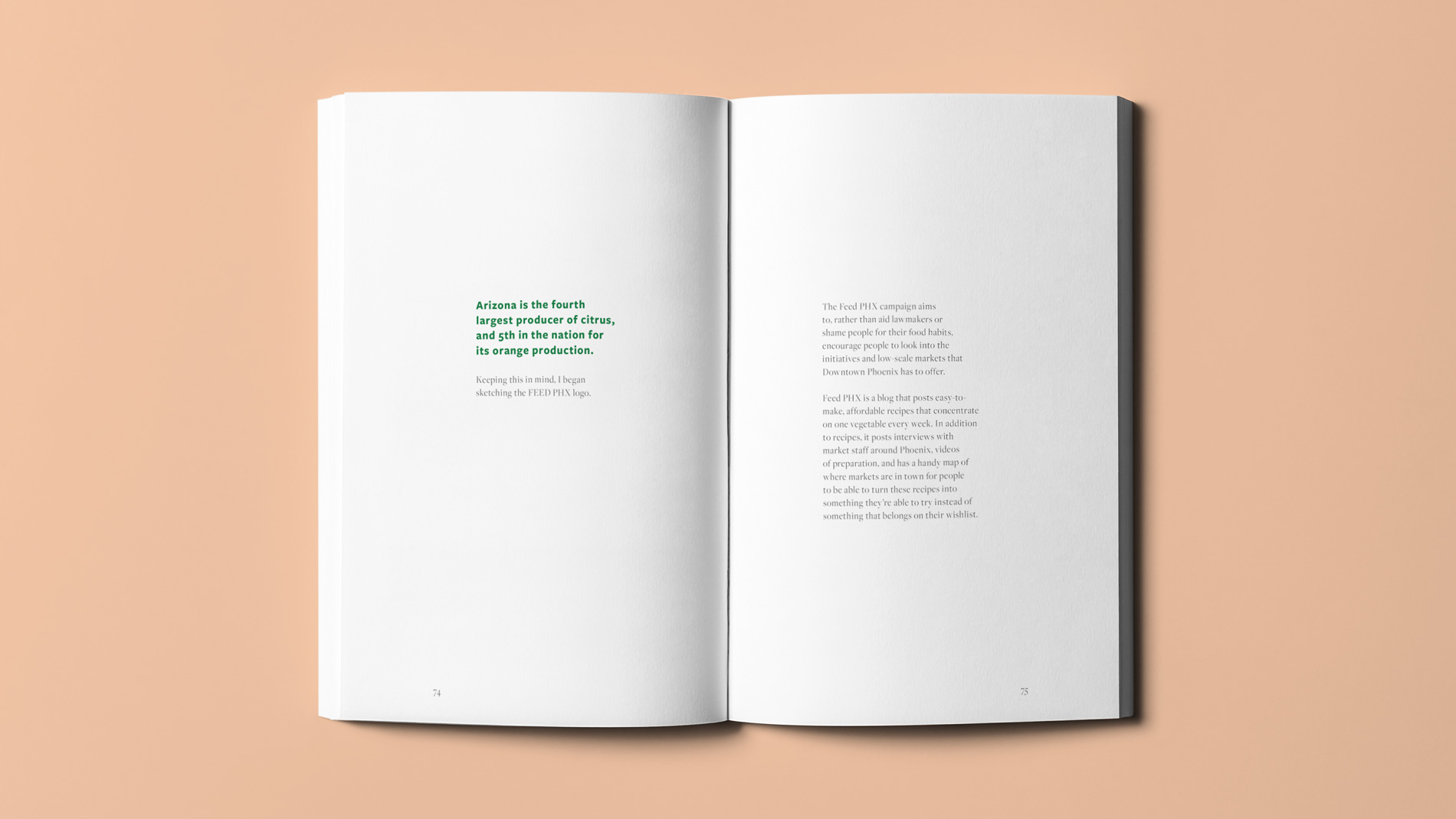
The second part is my book. The book, about 116 pages long, details the plan of Feed Phoenix as wells as shows the process of Feed PHX throughout my senior year.
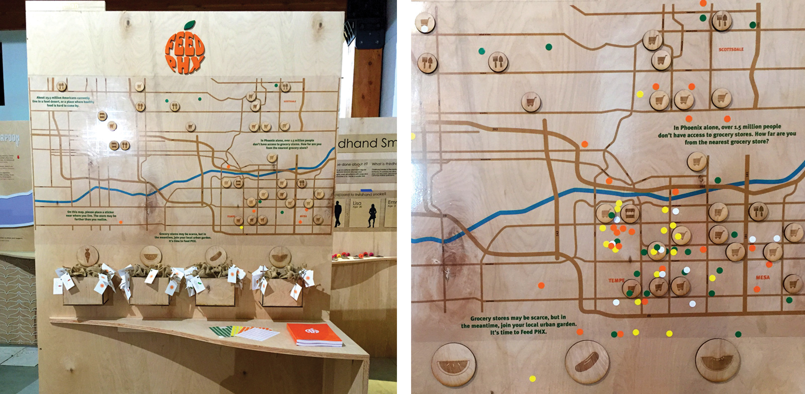
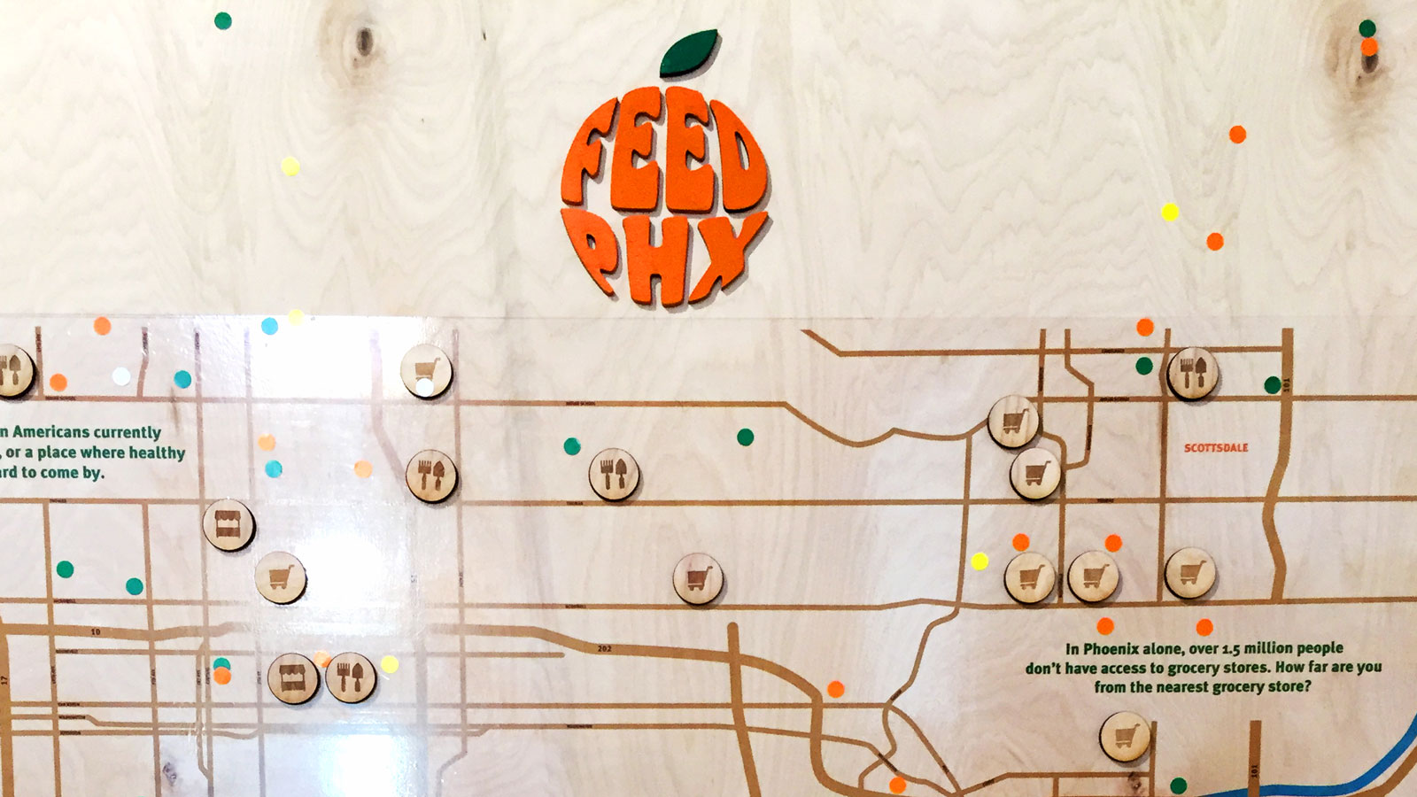
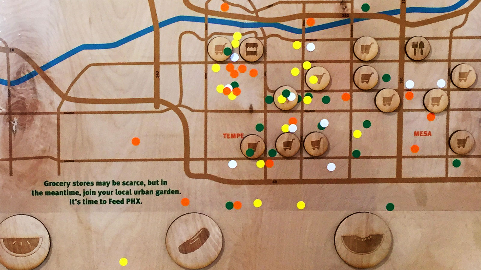
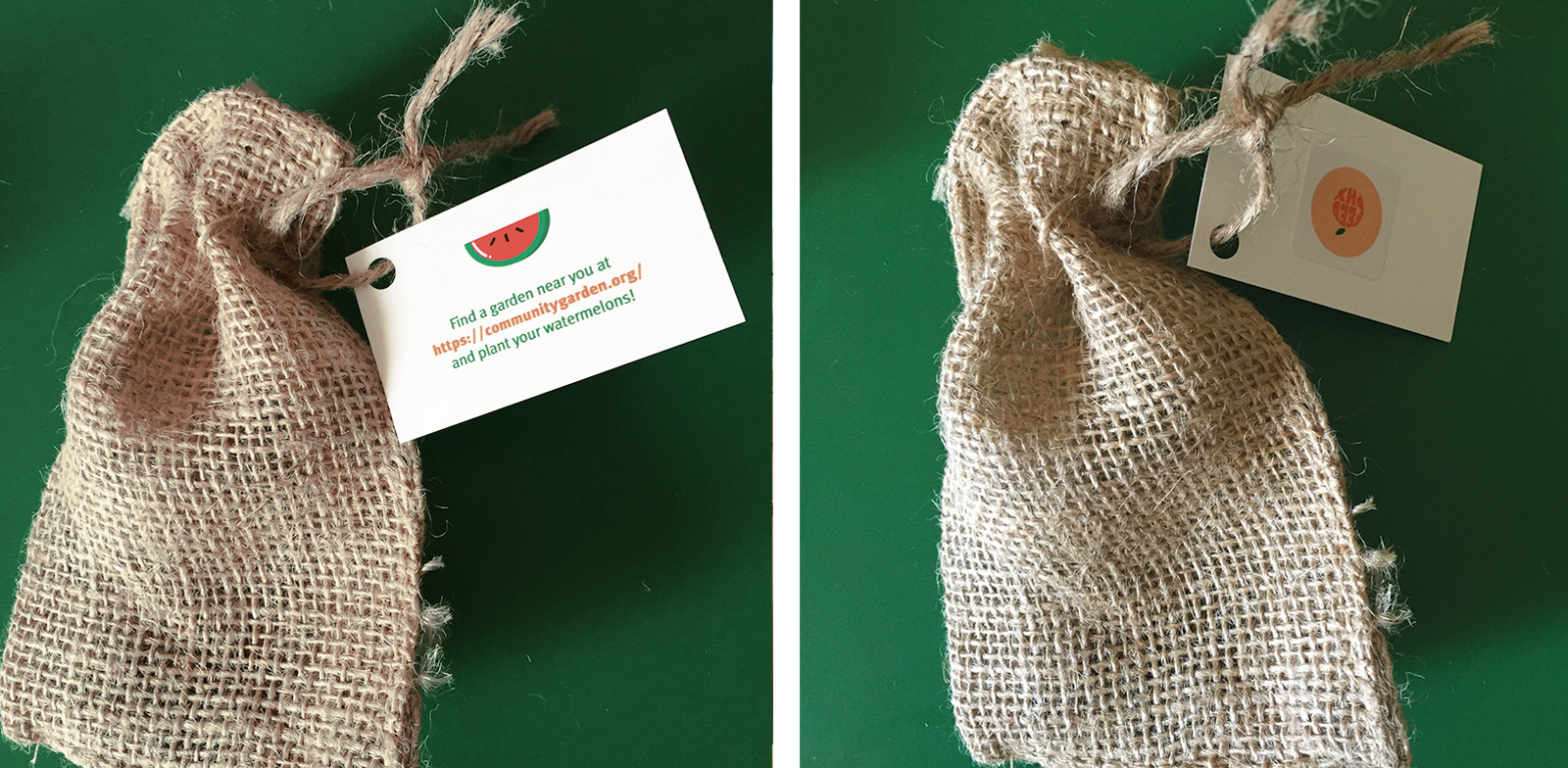
The third and final part draws attention to the lesser-known solution to food deserts: community gardens. My exhibit, a 4 by 7 foot interactive display, outlines my research while showing people the dire state of Phoenix. As a takeaway to remember Feed PHX by, I encourage people to embrace their inner hippie and plant four in-season fruits and vegetables I’ve found and placed on my exhibit in their local community garden or at home.


